Outline
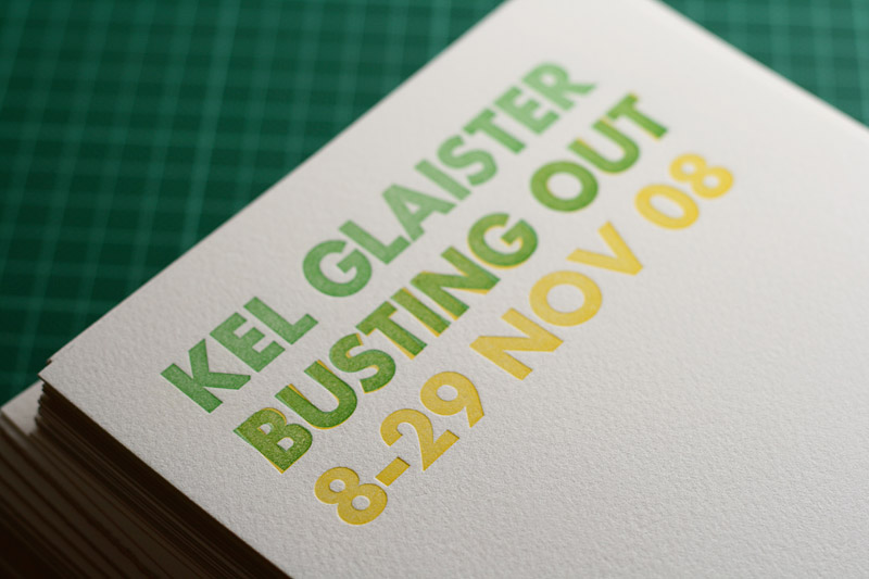
We printed some flyers for Kel Glaister’s latest show during a Letterpress workshop. Letterpress is both a beautiful and frustrating medium. The production of these flyers took an entire weekend, but the results were worth it. The tactile nature of the deeply debossed type makes a good piece of letterpress something to be treasured, rather than thrown away. Body copy was set in Garamond and the display type was set in Spartan, a Futura rip-off from the 50s.
- Year
- 2008
- Client
- Kel Glaister
- Partners
Idlewild Press — Letterpress studio

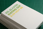
Exhibition flyers
A neat stack of the flyers after drying.
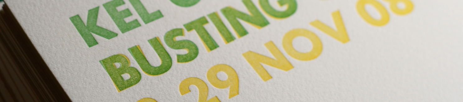
Detail
The show’s title, Busting Out, was overprinted in italic.
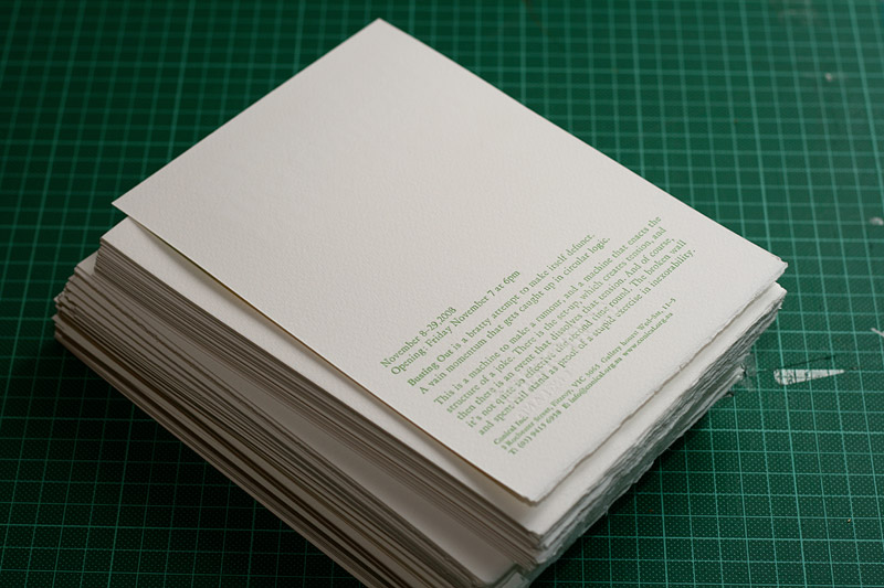
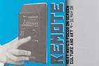
Reverse side
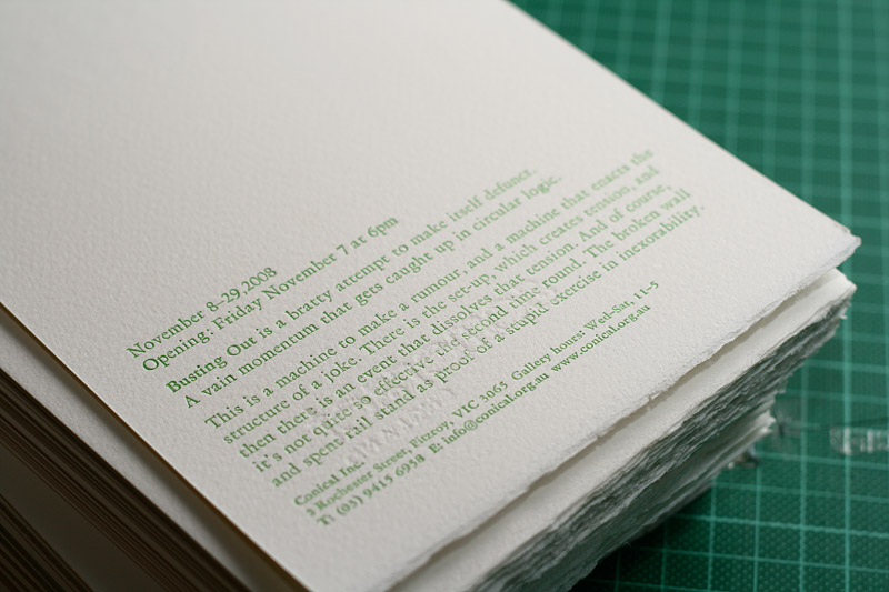
Body copy set in 13pt & 11pt Garamond.
Detail
Love the beautiful ragged edge on the bottom of the flyers.
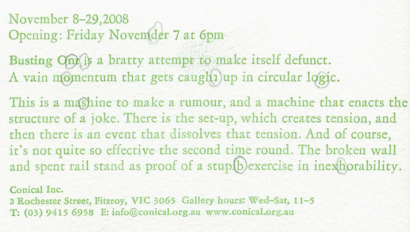
Spelling mistakes
Those new to hand-setting will usually make many mistakes, such as upside down or back to front letters and bizarre spelling mistakes. Here’s the first proof!