Outline
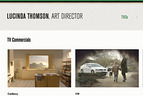
Lucinda came to us looking for a simple website to showcase her work for films and TV commercials. The approach was to focus absolutely on the work first; so we partnered this with a pared back design personality. We used compressed minimalist typography and a small coloured accent bar across the top of the site that changes colour on every page.
- Year
- 2012
- Client
- Lucinda Thomson
- URL
- lucindathomson.net

TVCs
The homepage showcases Lucinda’s recent TV Commercial work up front.

Coloured Headers
Each page uses a different coloured header strip — injecting personality without taking away the focus on Lucinda’s work.

Videos
Each TVC and Film has a simple viewing page for watching video clips and navigating to the next and previous clips.

Films
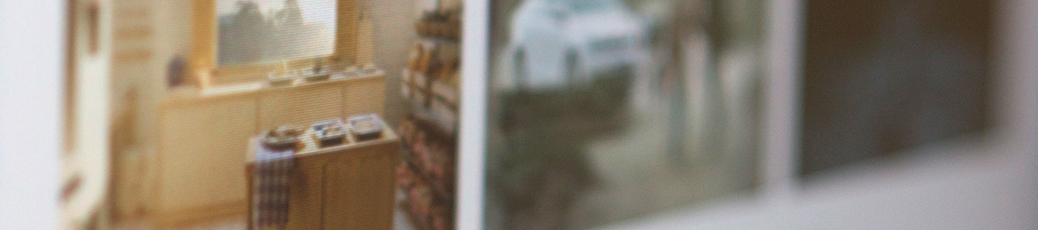
We enlarged the grid for the films page to heighten the importance of the imagery.

CV
A straight forward listing of Lucinda’s film and TVC credits.