Outline
The identity for Mardi Edwards was inspired by their beautiful and distinctive Art Deco tiling. We built a system of tile patterns that we used throughout the store’s signage and packaging.
- Year
- 2011
- Client
- Mardi Edwards Providore

Identity
These Art Deco tiles were our inspiration for the main graphic element of the identity.

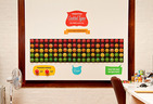
Vinyl tiles
We created vinyl versions of the tiles to use on blackboards through the deli. We noticed how well the loose handwriting paired with the geometric linework of the tiling.

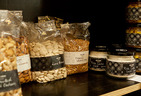
Labels
To cater for the deli’s constantly evolving product range, we designed their labels to be versatile and reusable. There is a large blank space that the staff handwrite the product names on.

Versatility
The same sized labels are used for all of the deli’s bags, jars, bottles and tins.

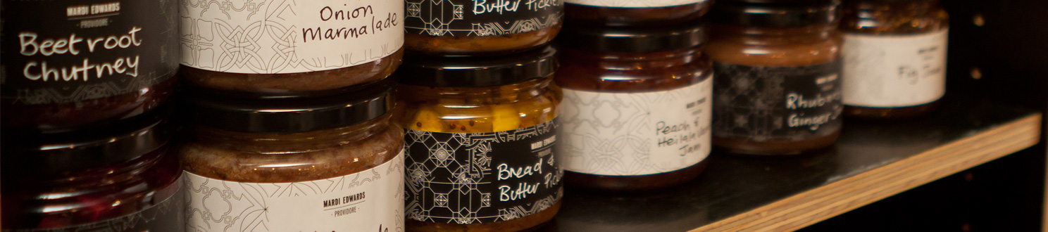
Black and white
Having two different coloured labels allows staff to choose which will best match the colours of each individual product.

Product focus
We kept the labels small enough to allow the product to be the centre of attention, not the label.