Outline
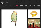
We designed and developed egetal’s new website to showcase their artists, update their customers, and begin selling their jewellery online. The design takes it’s cues more from a gallery than a store: they showcase their items as beautiful individual pieces rather than mass produced products. It’s achieved with a simple layout, lots of space, large product photos and clean typography.
- Year
- 2011
- Client
- e.g.etal
- Partners
That Mob — Project management
Inventive Labs — Shop customisation- URL
- egetal.com.au

Home
Features revolving pictures of featured items, random pieces, latest news, and gallery information. Text content is revealed on mouseover.

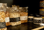
Store
The store is presented as series of beautiful square cropped photographs with extensive browsing options and searching. Mouseovers reveal alternative photographs of each item and text information.

Store — highlight
Clicking an item in the store reveals more information and a large photograph; to encourage quick browsing and comparisons.

Store — product
Individual product pages emphasise the gallery’s unique role as a curator of artist produced jewellery: text is treated simply as part of the store’s “soft-sell” approach.

Artists
Artists can be browsed by their popular pieces, or by mousing over, their portraits. This emphasises the bespoke nature of e.g.etal’s jewellery.

News
Extensive tagging and categorisation is used throughout the website: news posts include relevant artist’s jewellery items at the bottom, and you can see snippets of news posts when browsing an individual artist’s page.

About
We got to use some more vibrant colour schemes for some of the auxiliary pages of the website; informed by the colours that the gallery uses on their jewellery packaging.