Outline
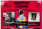
Back for another year; we were asked to work on the website again for the 09–10 summer season. Chase & Galley delivered another stellar poster campaign which had three different genre film treatments; each with unique illustrations, colour schemes and typography. We immediately set ourselves two challenging goals for the website: every page had to look like a poster, and have three different versions. Every page of the website randomly loads in one of the three different genre styles, and we included the worn edges of a poster at the top and bottom of every page of the site. It became exciting to explore and we found that it encouraged many visitors to spend many minutes clicking through every single film in the program.
- Year
- 2009
- Client
- Rooftop Cinema
- Partners
Chase and Galley — Print design
- URL
- 2009.rooftopcinema.com.au

Program
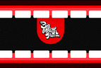
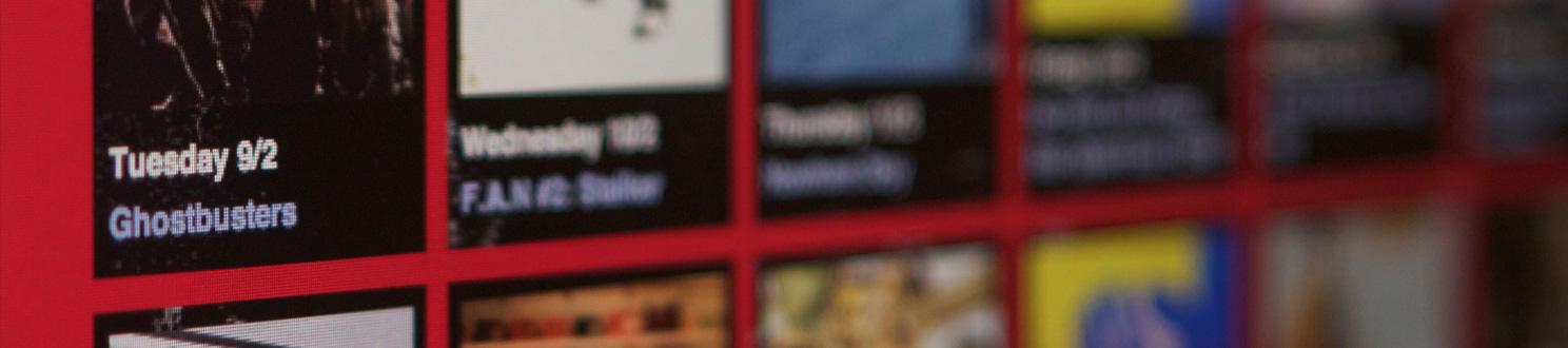
The design of the Program was heavily modelled on the iconic gridded layouts of the Astor Theatre calendars. Every week is presented on it’s own line; if you count six to a line it’s because Rooftop is closed on Mondays. A late change to the summer season meant that no movies would screen on Fridays, but the staff wanted visitors to realise that the bar would still be open. This was a design challenge, as skipping the Friday box would be potentially confusing; we decided to include crops of the genre illustrations inside the Friday boxes. If you look carefully you can see that the illustrations match up in successive three week blocks.

Home
You can see the different genre typography changing between each of the random front pages in the Twitter and Newsletter boxes. A particular favourite is the incredibly cheesy red vampire typeface.

Movies
This selection of movie pages highlights some of the serendipitous pairings of illustrations and film images that occurred as users browsed the site.