Outline
We were psyched to start designing the Text Camp reader for the 2010 Next Wave Festival, having thoroughly enjoyed Chase & Galley’s printed publication for the 2008 Festival. Our dreams for an experimental printed publication were quickly dashed — the project was to be principally a website. What do you do with a literary publication that doesn’t have the budget for an extended print run? Just throw it online and see if it sticks? Will anyone even read it?
- Year
- 2010
- Client
- Next Wave Festival
- URL
- textcamp.nextwave.org.au
Normal logo & safe logo
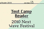
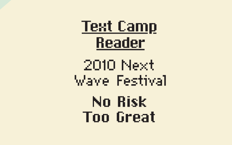
Visually, we wanted the Text Camp reader to respond to the 2010 Next Wave Festival theme, No Risk Too Great, and its implications in web development. Like most excitable developers we try and implement new technologies in our projects, often with some serious compatibility consequences. Older internet browsers won’t support newer technologies, and often require elaborate workarounds or alternative feature-limited versions. We decided to play with the idea of a website’s ‘safe mode’; harking back to our earlier computing ancestry. The logotype and top left corner of the site expose a diagonal slice of the alternate version underneath. By toggling the Safe Mode button, users can control their reading environment and switch between the safe and normal versions of the site.
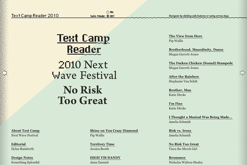
Horizontal layout
The format of this year’s Text Camp reader borrows heavily from Thinking for a Living, a marvellous online design publication by Duane King. The horizontal scrolling breaks the text up into manageable chunks, and the clean presentation allows a reader to concentrate on reading the articles rather than merely browsing them. There is an excellent article by Frank Chimero that details more of the thinking behind Thinking for a Living’s horizontal format, entitled ‘Horizontalism and Readability’.
Article layout 1
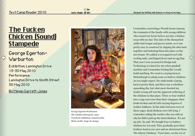
Reading on the web is a tricky thing. We’ve been trained to scan text rather than read it, and it was hard to imagine an online Text Camp reader as a workable reading experience. Extensive work on this topic has been undertaken by much smarter people than us; products like Marco Arment’s Instapaper and Inventive Labs’ Monocle spring to mind. Both of these projects present text content without the clutter and flash that characterise typical online reading experiences.
iPhone layout
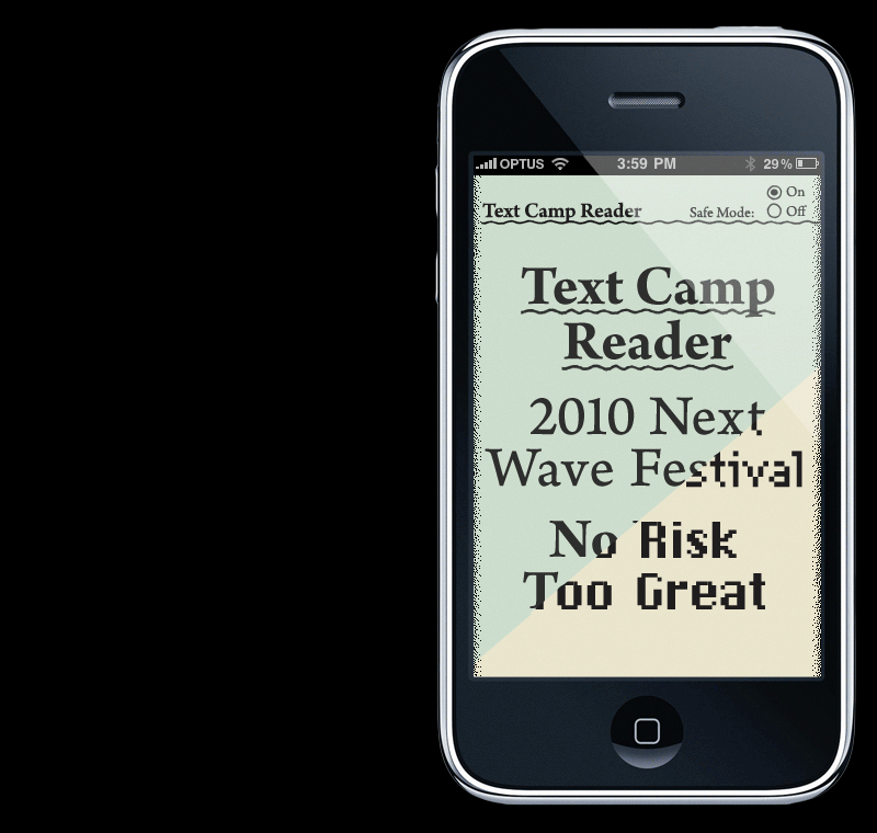
The clean, column-based layout also translates very well to the iPhone version of the site, where a single column fits perfectly on the mobile device’s screen.