Outline
The latest in an ocean of Silicon Valley finance start-ups, CashCompare needed a ship-shape branding in order to stay afloat. We rigged them a succinct and memorable name, and washed the decks with a clean pair of logotypes. We plundered a colour scheme and pattern from the fine linework found on banknotes, and set them sail with a promotional website.
- Year
- 2008
- Client
- CashCompare
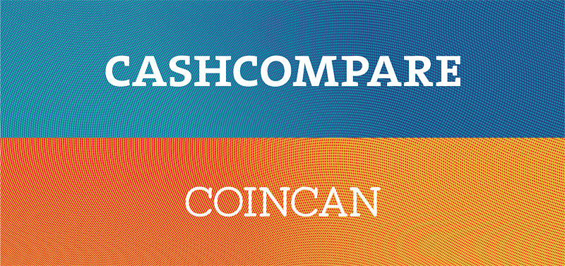
Duelling logos
The corporate logotype was created in a pair with the logotype of their first product, CoinCan. The corporate colour scheme was also designed to be a complimentary colour to CoinCan’s.
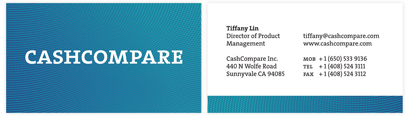
Business cards
Typeface duties are filled by de Groot’s The Serif.
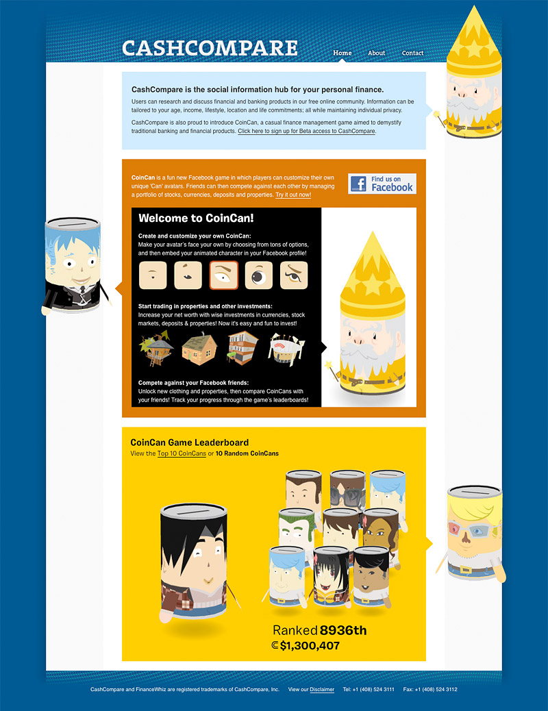
Website home
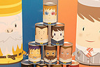
The website is filled with imagery from CashCompare’s first product, an educational finance game called CoinCan.
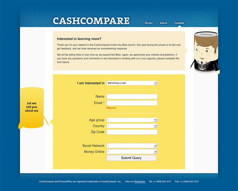
Website contact form
Since every player in the CoinCan game makes themselves a character, we used a silhouetted character to represent the person filling out the form on the website.
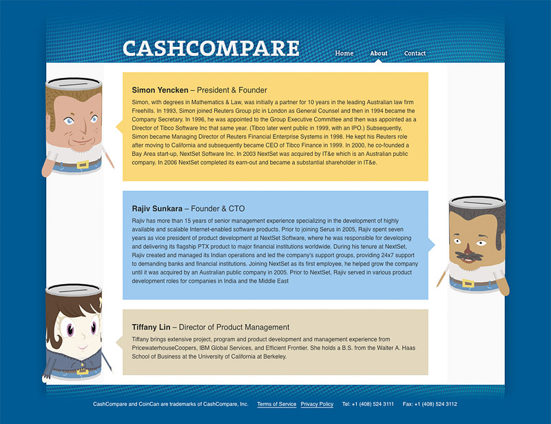
Website bio
The characters of the company’s founders are used on their biographies, instead of the usual dry corporate headshots.